Movable Chair


The International Symbol of Access, the standard white-on-blue image, was designed in 1968, and its use in parking spaces and buildings has become widely familiar. So familiar that it's taken on the “invisibility of the obvious.”
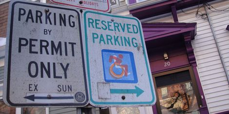
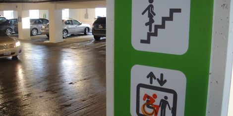
Only when I took note of some rare, but striking, newer designs did it occur to me how dramatic the differences are. The original image depicts a wooden, mechanical figure whose body is synonymous with the chair, while the new images show an active user: a person first, actively engaged in the world.
My sticker allows the old image to be visible, but superimposes the new image on top — in effect, editing public signage to provoke a set of social and political questions.
Accessibility is about a lot more than ramps and prosthetic limbs: people with disabilities often spend their lives with decisions being made for them, with their bodies and choices being handled by others.